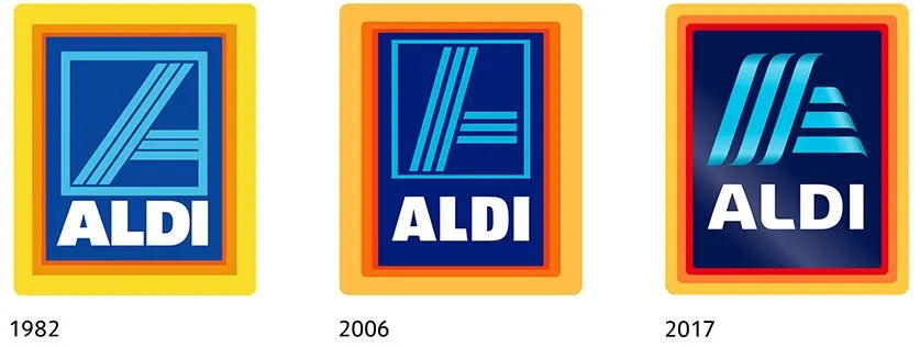
ALDI recently introduced a new modernized version of its logo, which will likely be rolling out to U.S. stores this June. (The original press release here (in German) contains a graphic showing its evolution over the years.) The new look is intended as a "contemporary and future-oriented" take on the current ALDI logo and to reflect its ongoing modernization and remodeling process.
And if you'd like to be amused, see here how one of ALDI's German competitors responded!
What do you think of the new ALDI logo?

Christian
Sunday 26th of March 2017
Looks good...
SSMark1
Friday 24th of March 2017
Logo - Smogo. I do care that this week when I went to go there to buy my cheap gallon of milk, the produce section looked like a tornado hit it. Worse than the toy aisles at Walmart during the busy holiday season. Now I know, if you work at Aldi, you do everything in the store from cashier, to stock, to clean, or whatever. And with the stores getting more popular, you would think they would increase the hours &/or the number of employees to keep up with the increase in volume / foot traffic.
SmartShopper
Friday 24th of March 2017
I like the new logo. The sharp corners of the previous letters in "ALDI" and the logo image are now rounded. I will enjoy this new look.
rifat
Friday 24th of March 2017
I'm waiting for Trump to tweet about it.
Dave
Friday 24th of March 2017
Every company has evolved to keep their brands fresh and current. Looks good to me.
Even blogs change looks over the years.
Dave davegates.net